Experience Surveys
Customer experience survey (or CX in short) is a new product in Zencity, meant to help 311 centers to produce meaningful insights from the feedback of residents who used 311 services. The initial task was to provide a POC for CX surveys, so we could start a trial with selected design partners. UI and all design components were either taken from the existing design system or made to stay consistent with platform components.
The main persona for CX surveys could hold different titles, such as:
- 311 call center general manager (only in large cities)
- City general manager / CEO persona
- CEO team members
The POC included 3 main tabs:
Main dashboard
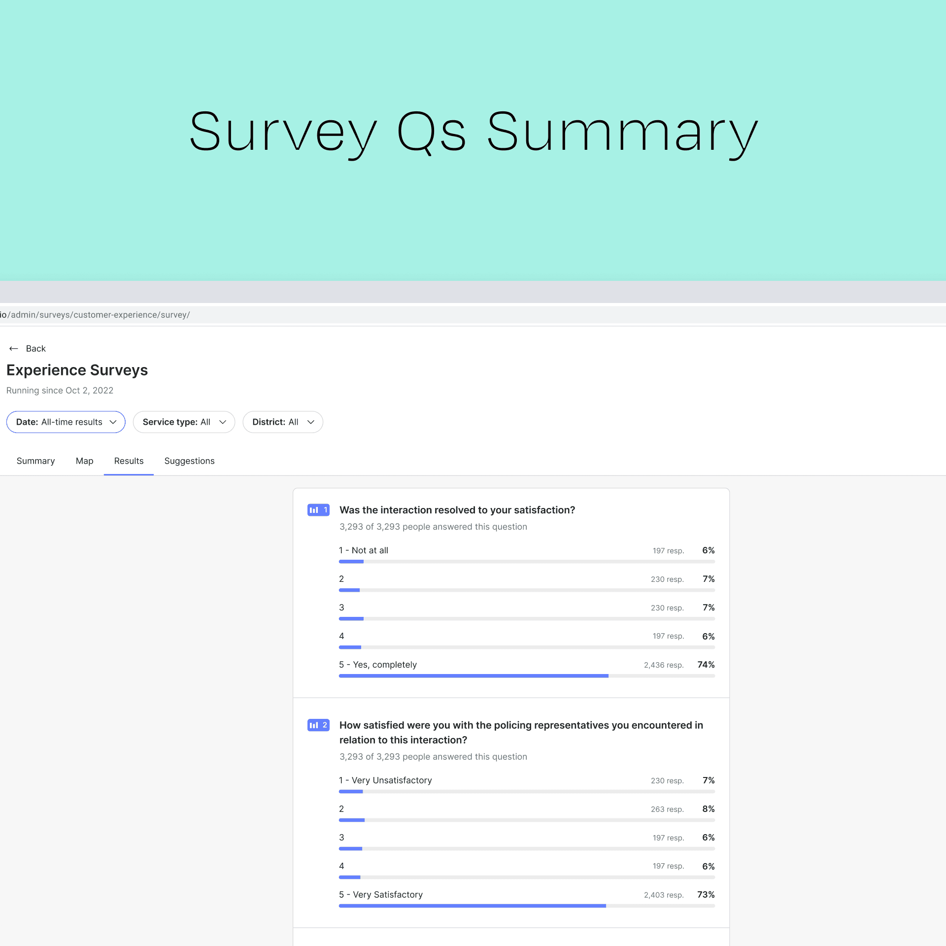
Survey results analysis
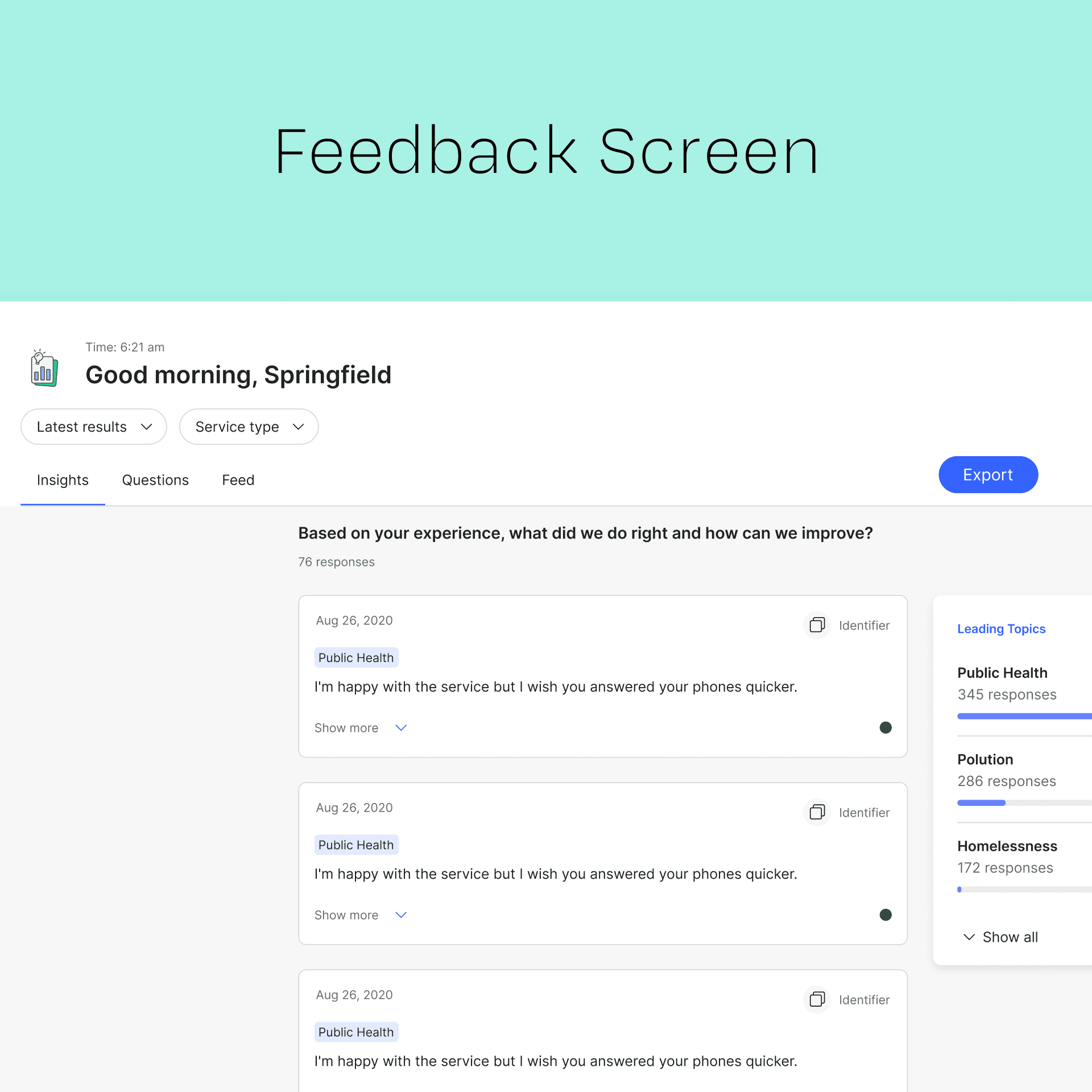
Resident feedback / suggestions
After the POC, the plan was to make the dashboard more actionable for decision makers based on initial feedback from 3 champions - i.e., to help detect areas where service could be improved and/or act on main resident feedback, provide geographically based data, etc.
Type of project
UX/UI
Role
Product Designer
Tools used
Figma
Year completed
2024
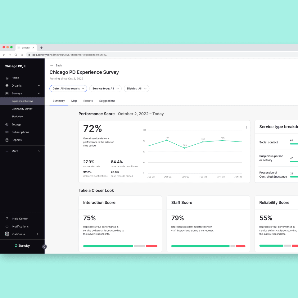
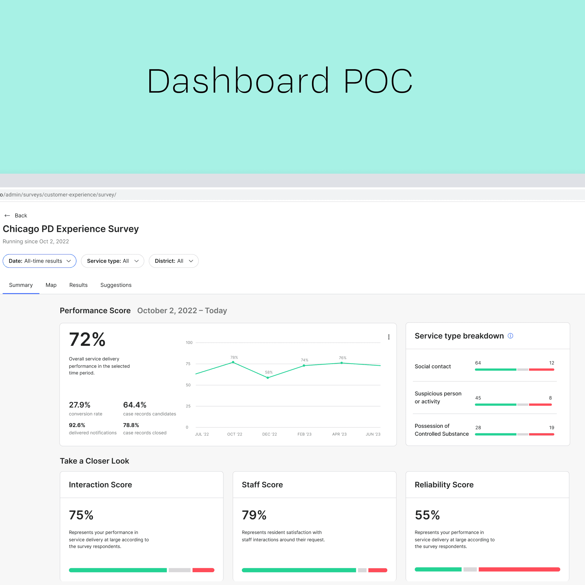
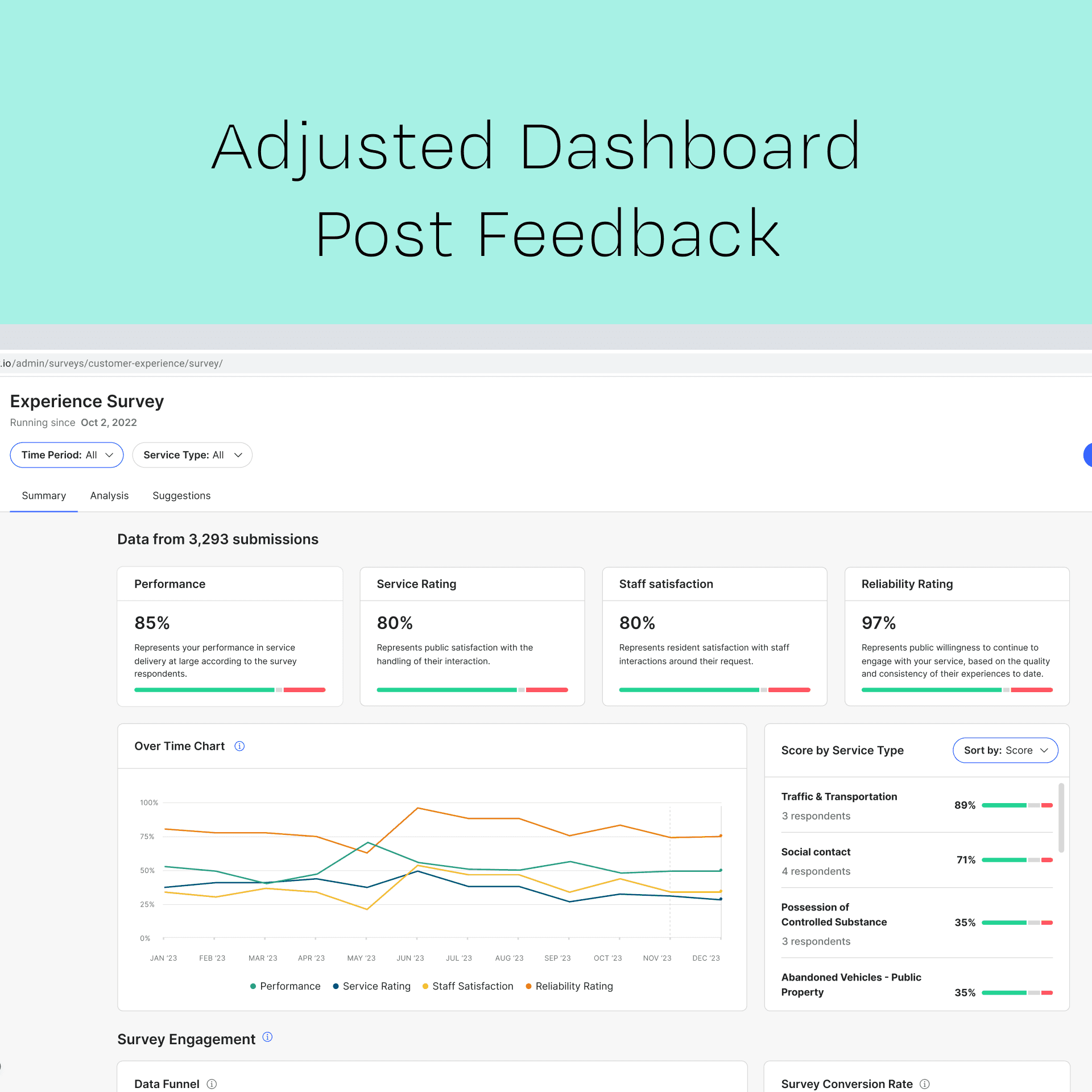
The main dashboard includes an overall performance score which is later broken down into different categories.
The main objective was to help execs receive a “big picture” assessment of 311 performance and quickly detect areas where performance needed to be improved.
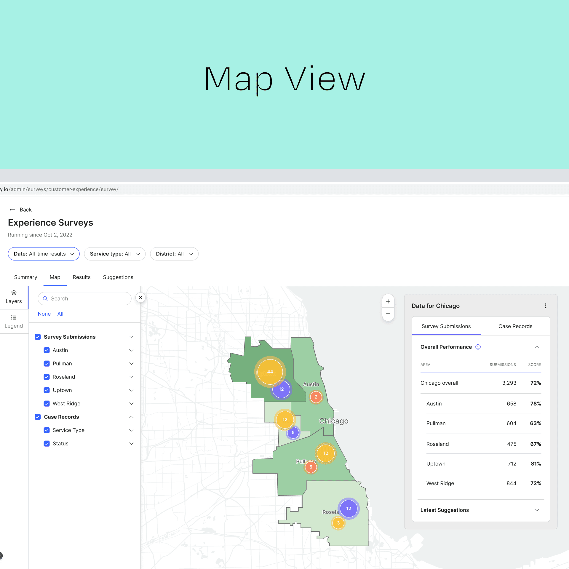
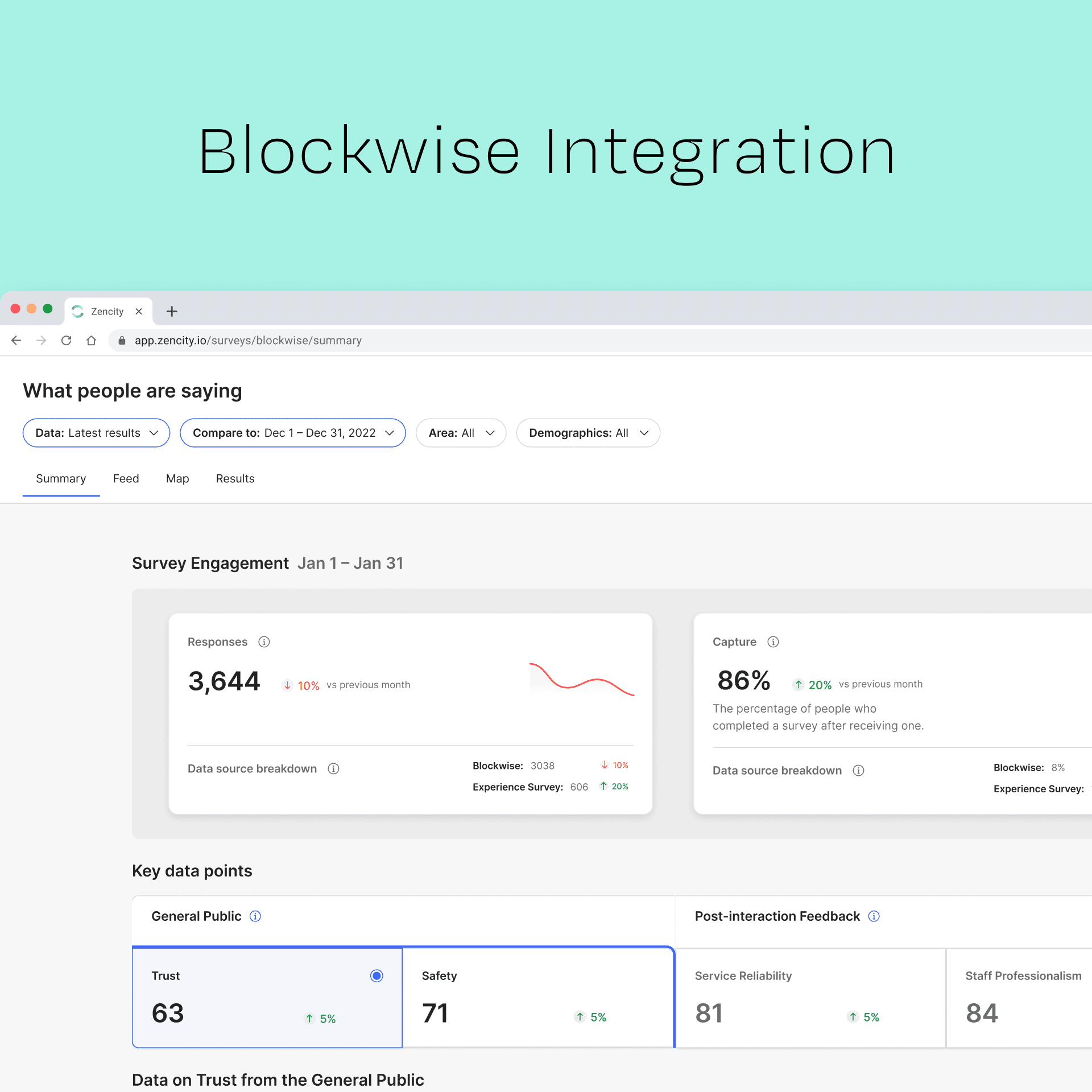
When scrolling further down, a map was added, with the thought of expanding it into another tab in the future. The purpose of the map was to help visualize areas of the city and find correlations between geographic areas and 311 issues (such as safety, sanitation, transportation, etc.), while also showing resident feedback locations.
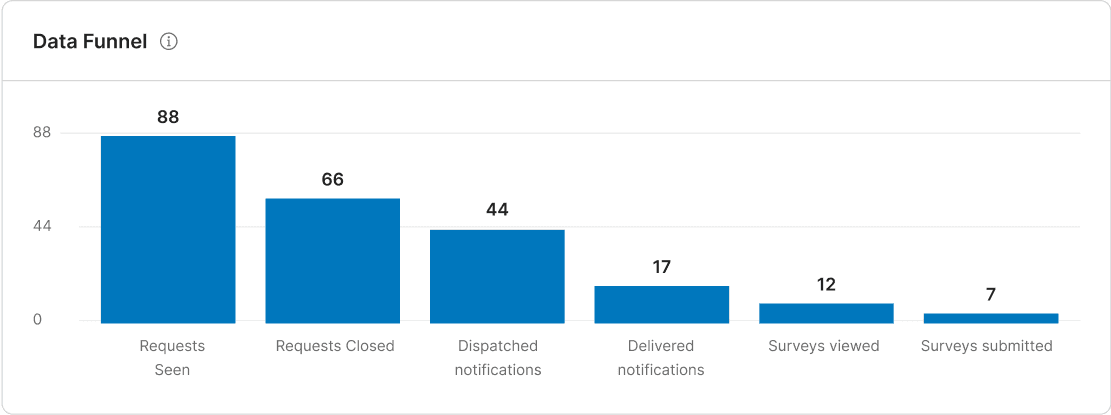
Another issue that came up following champion feedback was the need to detect conversion issues.
For POC purpose, a basic conversion funnel was added and meant to be evaluated later on, meaning it might be expanded into another tab or shown in a different order in the future.
Feedback rounds:
Initial feedback indicated the POC dashboard lacked actionability.
Meaning, execs and call center managers found the information shown relevant but didn’t really know how to act on it or what to do with it if their response rate was low. Also, different clients include different metrics in their performance which we needed to account for while also improving data readability.
Together with the PM, I’ve broken the Issues we needed to tackle based on feedback into a few main questions the dashboard needed to answer in order to be more actionable:
Why is my response rate low? what is working and what isn’t?
If response rates are low, what could be done about it?
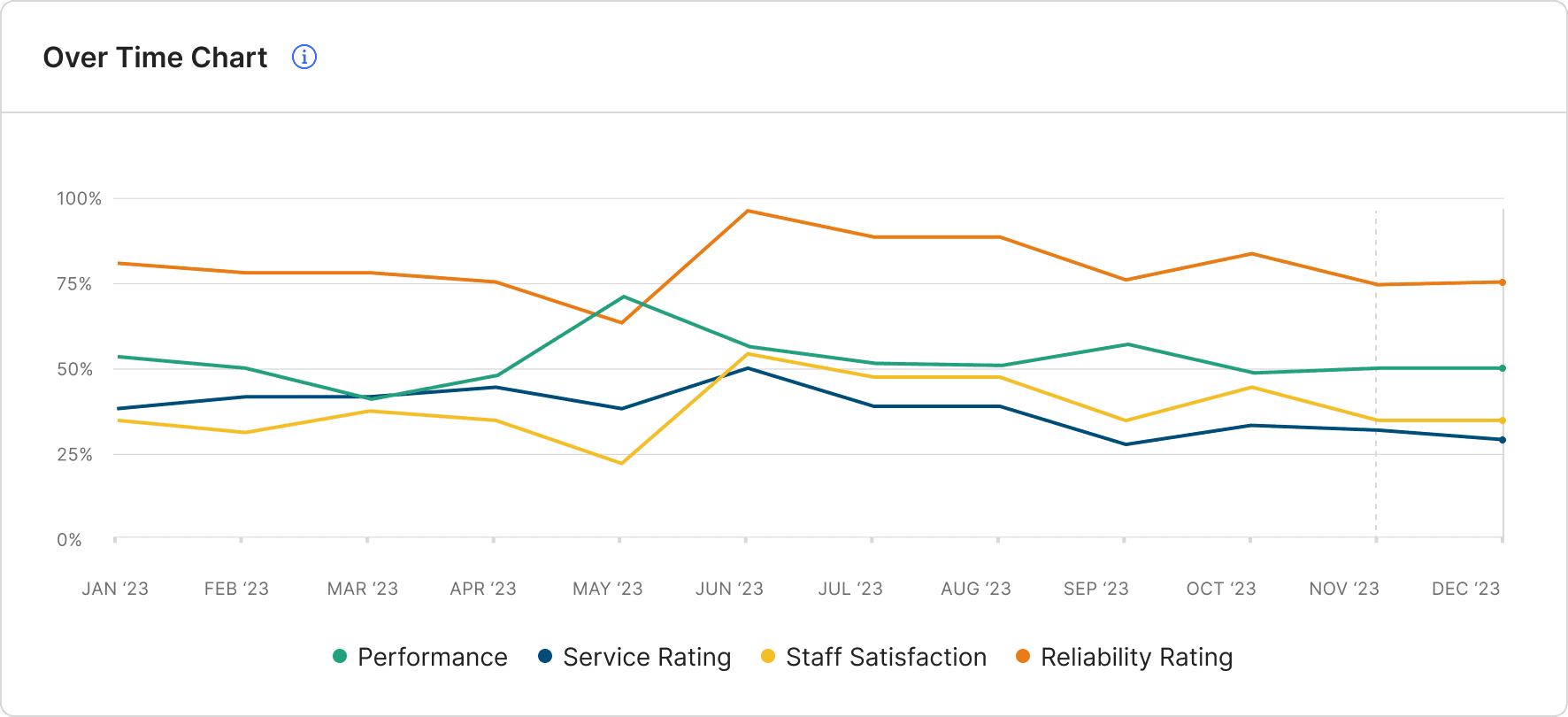
How can I check my progression over time in all metrics?
How can we show a breakdown of more than 3 metrics? metrics vary between 2-10 depending on the client.
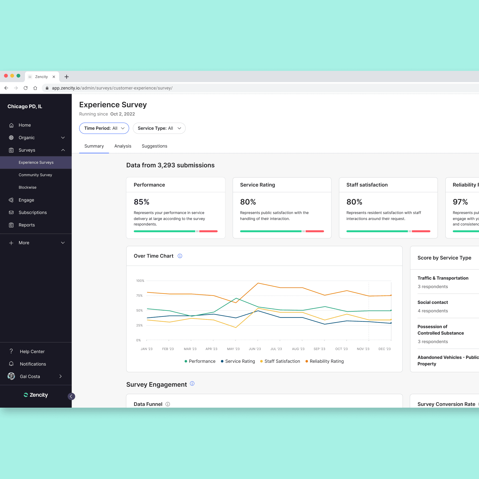
Post feedback dashboard screen:
The new dashboard aims to answer these questions:
Why is my response rate low? what is working and what isn’t?
a data funnel chart was added in order to indicate of any conversion funnel issues. if overall conversion is low we should be able to see where is it dropping in the funnel.
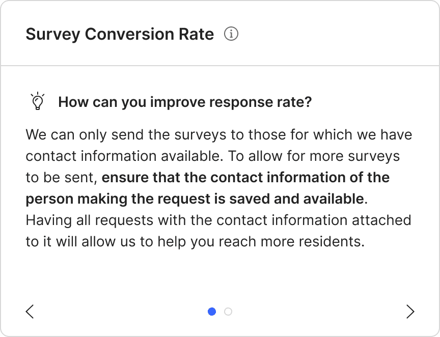
If response rates are low, what could be done about it?
in addition to the data funnel chart we’ve added an explainer widget to help the client understand what could be the reason behind lower response rates.
We’ve found that many times, conversion rate is affected by the way data is stored and processed in the 311 call center, where we can’t influence it but our clients can improve the way they tag and store data to ensure we reach all survey respondents.
New funnel widget was added after initial feedback
New conversion funnel widget added
New line chart detailing performance metrics over time was added:
